Project Objective

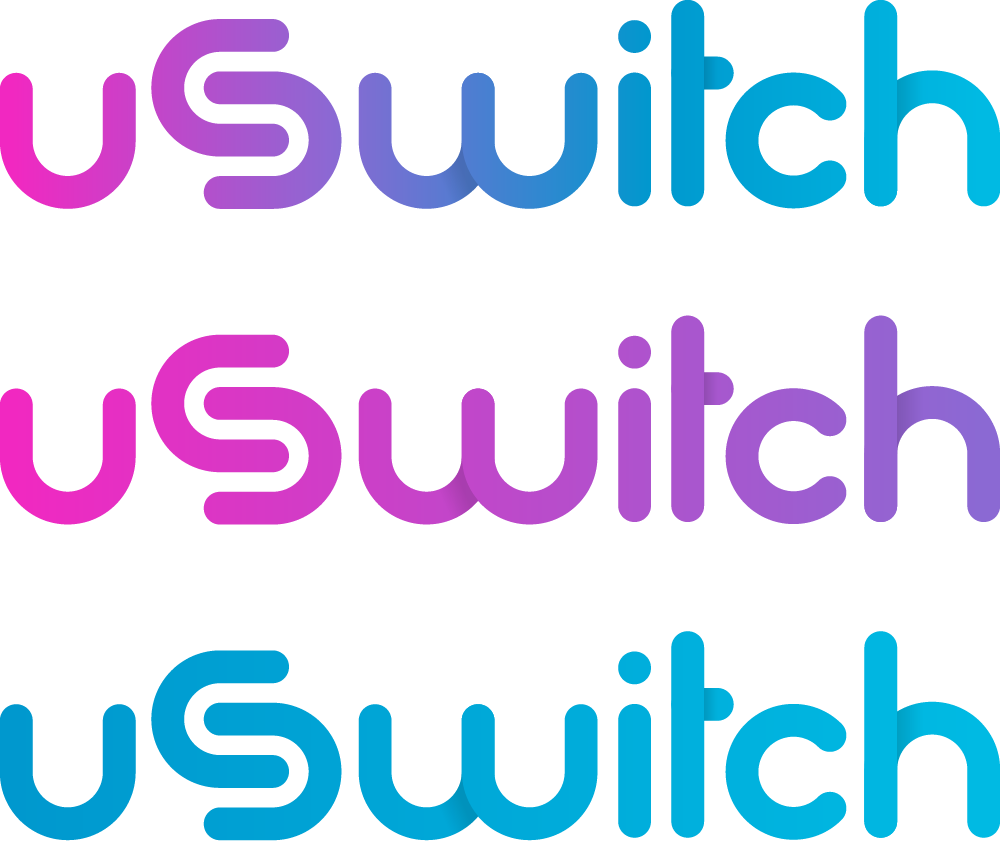
Rebrand the Diversity HD gaming platform under the new name “uSwitch” with a refreshed look and feel to the systems user interface.

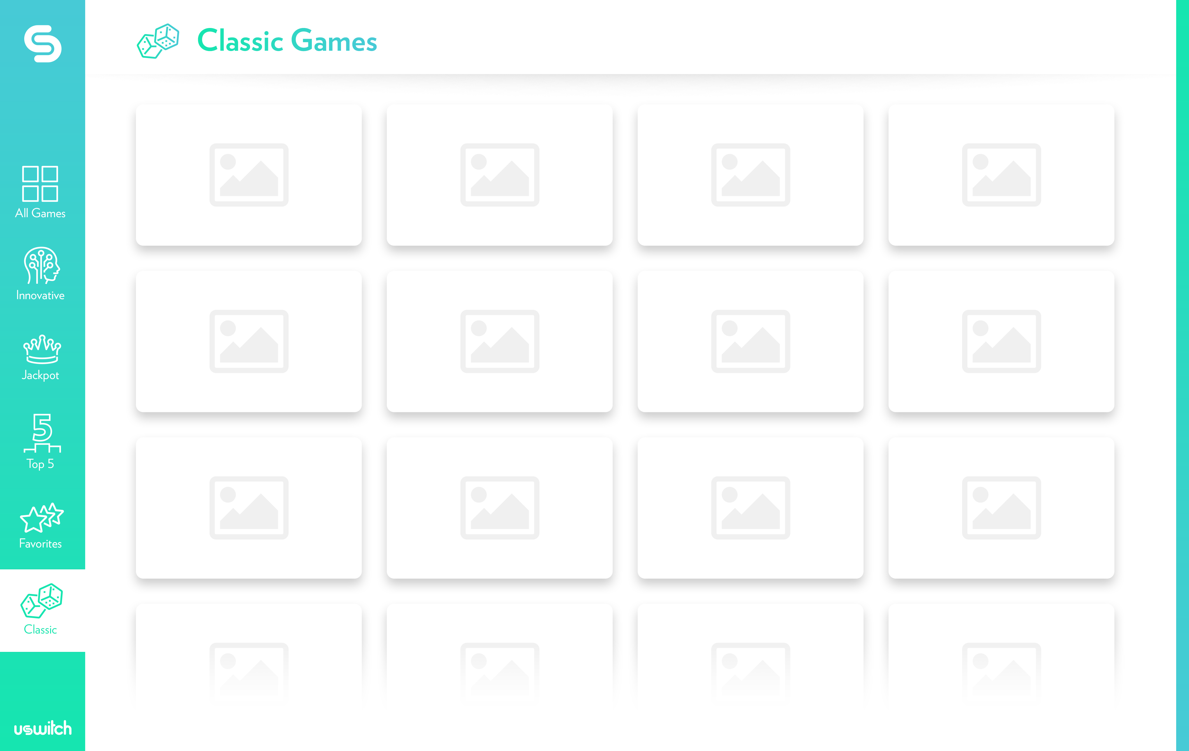
Develop a user-focused identity for a streamlined multi-game platform that will scale and adapt to multiple form factors while maintaining a strong, distinguished identity.

Design Goals

Fun, friendly, and approachable while maintaining a responsible and sophisticated structure.

Inspiration:

Switch, Switching, Rotating, Switching between activities.

Making the mark

The concept behind this mark begins with U (you) as a portrayal of the player, combined with the action of switching between games.

Combining U (you) and S (switch) into a mark that represents the movement of switching from one activity to another.

uSwitch logo design

Custom Typography

A custom typeface was constructed from the “U” shape of the mark to create a unique wordmark that matches the logo perfectly. Its curved shape and fluid motion make it fun, friendly, and approachable to players, while its clean geometric shapes maintain a sense of maturity, structure, and responsibility.

Color Palette

A vibrant color palette was chosen to reinforce the fun and friendly approach for the identity. A gradient was developed using four colors to allow for a variety of options when styling various game categories within the uSwitch system’s interface. This also provides added flexibility for print and digital assets.

#EF2AC1

#8969D3

#0097CE

#00B9E3

#BECCD5

#293033

Usage

The mark itself is great for use as an icon or for clean and impactful branding within the system interface.

When using the full logo lockup, a standard “S” is used in the “uSwitch” name to avoid redundancy.

When the name needs to be spelled out but space is limited, the icon is integrated into the wordmark to ensure that the identity is always present.

Stylized “uSwitch” in copy. Lower-case “u”, upper-case “S”.

Icon

Lockup

Workmark

User Interface

The primary pain-point of the previous system was that players experienced a difficulty in navigating to the games they wanted to play. They needed to take the time to learn the interface and understand how to interact with it before they could begin playing.

With “ease of use” as the top priority, this concept for the new uSwitch user interface was developed. It’s grid layout provides the expandability requred for adding endless games while it’s sidebar navigation systems allows players from any demographic and experience level the ability to sit down in front of a uSwitch system for the first time and understand exactly how to switch between the various categories, scroll up and down, and jump right into playing their favorite games.

No learning curve means no wasted time. The UI is out of the way to allow the games to shine.

Animation

Logo Reveal

Loading Animation